Security News
GitHub Removes Malicious Pull Requests Targeting Open Source Repositories
GitHub removed 27 malicious pull requests attempting to inject harmful code across multiple open source repositories, in another round of low-effort attacks.
The rc-tree npm package is a React component for displaying tree views. It provides flexible and efficient tree components with customizable nodes, drag-and-drop functionality, checkable nodes, and event handling for various actions like select, check, load data asynchronously, and more. It's suitable for implementing features like file systems, nested menus, or any hierarchical data representation.
Basic Tree Structure
This feature allows the creation of a basic tree structure with nested nodes. The `treeData` prop defines the hierarchical structure of the tree.
import Tree from 'rc-tree';
const treeData = [{
title: 'parent 1',
key: '0-0',
children: [{
title: 'child 1-1',
key: '0-0-1',
children: [{
title: 'leaf',
key: '0-0-1-1'
}]
}, {
title: 'child 1-2',
key: '0-0-2',
children: [{
title: 'leaf',
key: '0-0-2-1'
}]
}]
}];
<Tree treeData={treeData} />
Drag-and-Drop
Enables drag-and-drop functionality within the tree, allowing users to reorder nodes by dragging them. Event handlers like `onDragEnter` and `onDrop` can be used to manage the drag-and-drop process.
import Tree from 'rc-tree';
<Tree
treeData={treeData}
draggable
onDragEnter={info => console.log('enter:', info)}
onDrop={info => console.log('drop:', info)}
/>
Checkable Nodes
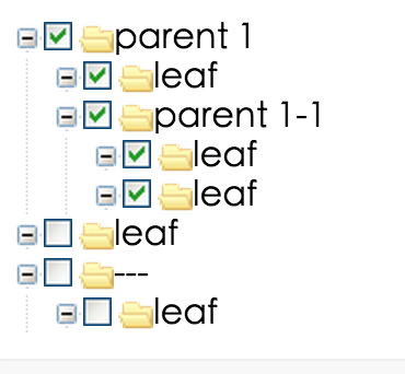
This feature adds checkboxes to tree nodes, making them selectable. The `onCheck` event handler is triggered when checkboxes are checked or unchecked, allowing for custom handling of these events.
import Tree from 'rc-tree';
<Tree
checkable
onCheck={checkedKeys => console.log('onCheck', checkedKeys)}
treeData={treeData}
/>
Async Data Loading
Supports loading data asynchronously for nodes. This is useful for loading child nodes on demand, for example, when a node is expanded. The `loadData` function is called to fetch child nodes asynchronously.
import Tree from 'rc-tree';
const loadData = treeNode =>
new Promise(resolve => {
setTimeout(() => {
resolve();
}, 1000);
});
<Tree loadData={loadData} treeData={treeData} />
A package that provides a higher-order component for creating sortable drag-and-drop trees. It offers similar drag-and-drop capabilities but focuses more on the sorting aspect within the tree structure, compared to rc-tree's broader feature set.
While not exclusively a tree component library, Ant Design (antd) includes a Tree component with features similar to rc-tree, such as drag-and-drop, checkable nodes, and async data loading. Ant Design's Tree component is styled according to the Ant Design system, providing a consistent look and feel for applications using Ant Design.
tree ui component for react
http://localhost:8018/examples/
online example: http://react-component.github.io/tree/examples/
see examples
name | description | type | default |
---|---|---|---|
autoExpandParent | whether auto expand parent treeNodes | bool | false |
checkable | whether support checked | bool/React Node | false |
checkedKeys | Controlled checked treeNodes(After setting, defaultCheckedKeys will not work). Note: parent and children nodes are associated, if the parent node's key exists, it all children node will be checked, and vice versa. When set checkable and checkStrictly, it should be an object, which contains checked array and halfChecked array. | String[]/{checked:Array,halfChecked:Array} | [] |
checkStrictly | check node precisely, parent and children nodes are not associated | bool | false |
className | additional css class of root dom node | String | '' |
defaultCheckedKeys | default checked treeNodes | String[] | [] |
defaultExpandedKeys | expand specific treeNodes | String[] | - |
defaultExpandAll | expand all treeNodes | bool | false |
defaultExpandParent | auto expand parent treeNodes when init | bool | true |
defaultSelectedKeys | default selected treeNodes | String[] | [] |
disabled | whether disabled the tree | bool | false |
draggable | whether can drag treeNode. (drag events are not supported in Internet Explorer 8 and earlier versions or Safari 5.1 and earlier versions.) | bool | false |
expandedKeys | Controlled expand specific treeNodes | String[] | - |
filterTreeNode | filter some treeNodes as you need. it should return true | function(node) | - |
icon | customize icon. When you pass component, whose render will receive full TreeNode props as component props | element/Function(props) | - |
loadedKeys | Mark node is loaded when loadData is true | string[] | - |
loadData | load data asynchronously and the return value should be a promise | function(node) | - |
multiple | whether multiple select | bool | false |
prefixCls | prefix class | String | 'rc-tree' |
selectable | whether can be selected | bool | true |
selectedKeys | Controlled selected treeNodes(After setting, defaultSelectedKeys will not work) | String[] | [] |
showIcon | whether show icon | bool | true |
showLine | whether show line | bool | false |
treeData | treeNodes data Array, if set it then you need not to construct children TreeNode. (value should be unique across the whole array) | array<{key,title,children, [disabled, selectable]}> | - |
onCheck | click the treeNode/checkbox to fire | function(checkedKeys, e:{checked: bool, checkedNodes, node, event, nativeEvent}) | - |
onExpand | fire on treeNode expand or not | function(expandedKeys, {expanded: bool, node, nativeEvent}) | - |
onDragEnd | it execs when fire the tree's dragend event | function({event,node}) | - |
onDragEnter | it execs when fire the tree's dragenter event | function({event,node,expandedKeys}) | - |
onDragLeave | it execs when fire the tree's dragleave event | function({event,node}) | - |
onDragOver | it execs when fire the tree's dragover event | function({event,node}) | - |
onDragStart | it execs when fire the tree's dragstart event | function({event,node}) | - |
onDrop | it execs when fire the tree's drop event | function({event, node, dragNode, dragNodesKeys}) | - |
onLoad | Trigger when a node is loaded. If you set the loadedKeys , you must handle onLoad to avoid infinity loop | function(loadedKeys, {event, node}) | - |
onMouseEnter | call when mouse enter a treeNode | function({event,node}) | - |
onMouseLeave | call when mouse leave a treeNode | function({event,node}) | - |
onRightClick | select current treeNode and show customized contextmenu | function({event,node}) | - |
onSelect | click the treeNode to fire | function(selectedKeys, e:{selected: bool, selectedNodes, node, event, nativeEvent}) | - |
switcherIcon | specific the switcher icon. | ReactNode / (props: TreeNodeAttribute) => ReactNode | - |
note: if you have a lot of TreeNode, like more than 1000,
make the parent node is collapsed by default, will obvious effect, very fast.
Because the children hide TreeNode will not insert into dom.
name | description | type | default |
---|---|---|---|
className | additional class to treeNode | String | '' |
style | set style to treeNode | Object | '' |
disabled | whether disabled the treeNode | bool | false |
disableCheckbox | whether disable the treeNode' checkbox | bool | false |
title | tree/subTree's title | String/element | '---' |
key | it's used with tree props's (default)ExpandedKeys / (default)CheckedKeys / (default)SelectedKeys. you'd better to set it, and it must be unique in the tree's all treeNodes | String | treeNode's position |
isLeaf | whether it's leaf node | bool | false |
icon | customize icon. When you pass component, whose render will receive full TreeNode props as component props | element/Function(props) | - |
switcherIcon | specific the switcher icon. | ReactNode / (props: TreeNodeAttribute) => ReactNode | - |
The number of treeNodes can be very large, but when enable checkable
,
it will spend more computing time, so we cached some calculations(e.g. this.treeNodesStates
),
to avoid double computing. But, this bring some restrictions,
when you async load treeNodes, you should render tree like this
{this.state.treeData.length ? <Tree ...>{this.state.treeData.map(t => <TreeNode ... />)}</Tree> : 'loading tree'}
npm install
npm start
http://localhost:8018/tests/runner.html?coverage
rc-tree is released under the MIT license.
FAQs
tree ui component for react
We found that rc-tree demonstrated a healthy version release cadence and project activity because the last version was released less than a year ago. It has 11 open source maintainers collaborating on the project.
Did you know?
Socket for GitHub automatically highlights issues in each pull request and monitors the health of all your open source dependencies. Discover the contents of your packages and block harmful activity before you install or update your dependencies.
Security News
GitHub removed 27 malicious pull requests attempting to inject harmful code across multiple open source repositories, in another round of low-effort attacks.
Security News
RubyGems.org has added a new "maintainer" role that allows for publishing new versions of gems. This new permission type is aimed at improving security for gem owners and the service overall.
Security News
Node.js will be enforcing stricter semver-major PR policies a month before major releases to enhance stability and ensure reliable release candidates.